


How to Choose the Perfect Color Combination for Studio Photography Sessions: Color Palette Guide for Photographers?
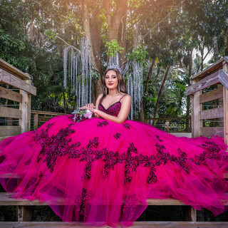

For in-studio photo sessions, colors and styles are to be chosen in such a way that the overall selection would be harmonious and attractive. In this article, I will show you how to match the colors and give you examples of palettes so you can get some really cool sessions—not only if you specialize in family photography or maternity photography but also in smash cake photography.
In-studio photography requires carefully chosen colors and styles to create a visually pleasing outcome, and in this article, I'll show you how to coordinate colors with examples of palettes that work perfectly for family, maternity, and smash cake photography sessions.
1. The Power of Neutral and Pastel Colors
One of the most recommended combinations for studio sessions is using neutral and pastel tones. These shades create a soft, warm, and professional atmosphere. For a family photography session, colors like beige, light gray, soft pink, and pastel blue work wonderfully. The background and outfits should complement each other without clashing, generating a clean and modern aesthetic.
Here’s an example of a family dressed in pastel tones, illustrating how colors can be combined harmoniously:

Where elegance meets love 
A heartwarming family portrait 
A sweet moment.
2. Complementary Colors for Dynamic Sessions
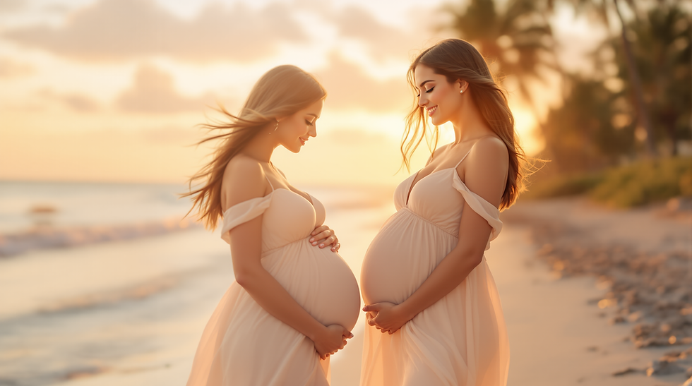
In maternity photography sessions, you can opt for a palette that includes complementary colors like blue and orange, or purple and yellow. These contrasts add a touch of visual energy without losing elegance, especially when the aim is to highlight the expecting mother as the focal point.
Recommended Palette:
Sky Blue
Peach Orange
Soft Gray
White

The beauty of pregnancy 
A loving kiss on her belly 
The beauty of pregnancy
"Vincent van Gogh, famously explored how contrasting colors could enhance each other. He described complementary colors as "colors which complete each other, like man and woman." Van Gogh believed that these pairs of hues, such as blue and orange or red and green, formed a kind of visual marriage, where each color made the other shine more brilliantly without causing visual conflict" (Painting My World).
3. Vibrant and Colorful for Smash Cake Sessions IN-Studio Photography
For smash cake photography, color is key. These sessions tend to be fun and cheerful, so vibrant tones like reds, yellows, and bright blues are ideal. At the same time, it's important that the colors don't overwhelm, so they can be combined with more neutral tones in the background or decorative elements.
Recommended Palette:
Vibrant Yellow
Light Blue
White
Bright Pink

A colorful smash cake 
Let them eat cake! 
Bright colors and sweet smiles
4. Monochromatic Palettes for a Sophisticated Look
If you're looking for a more refined and elegant look, monochromatic palettes are perfect. For fashion or maternity sessions, choosing variations of the same tone, such as different shades of gray or blue, can bring a touch of effortless elegance.
Recommended Palette:
Dark Gray
Light Gray
White
Black
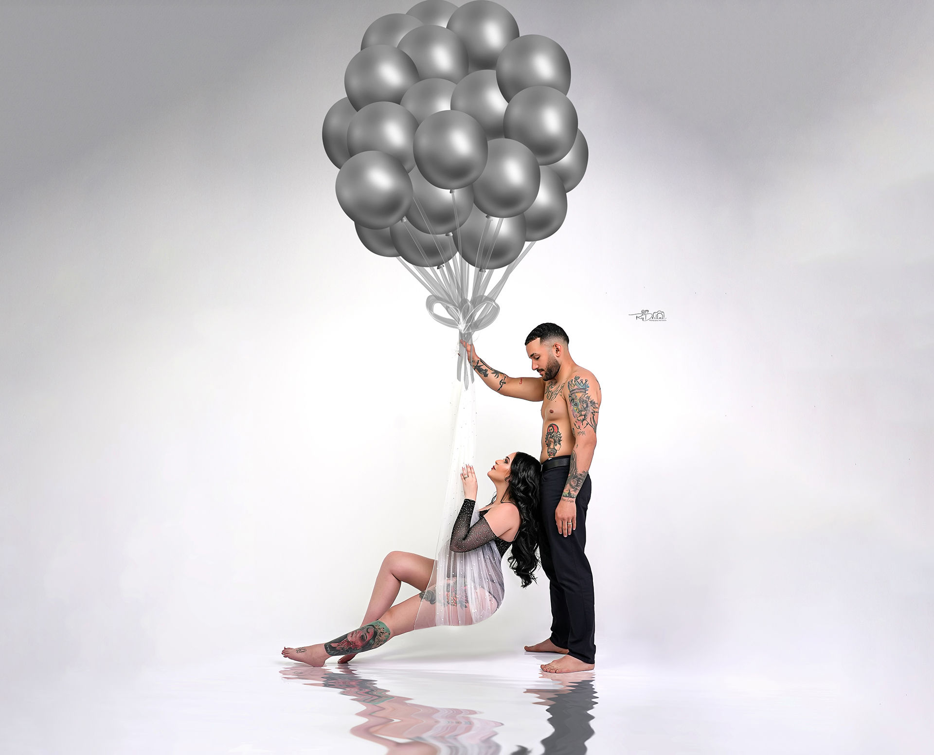
A serene maternity portrait 
Monochromatic fashion look 
Elegance in every curve
In conclusion, selecting the right color palette for your studio photography sessions is essential for creating visually stunning and cohesive images. Whether you’re shooting family photography, maternity photography, or smash cake photography, a well-chosen color scheme can elevate your photos to the next level.
Ready to make your sessions pop with the perfect colors? Click here to explore more tips and start planning your next shoot! Don’t forget to leave a comment below with your favorite color combinations.


Comments